SOS Website Development
Hello! We are Kyle & Thea and we were tasked with creating a system that tackles a current issue or popular topic. We chose the COVID-19 outbreak and the struggles surrounding social distancing as our main point of focus.
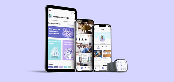
We designed an app called Surviving our Separation which dives into the positive and negative aspects of social distancing due to stay-at-home orders across the world. The app, when used to its fullest potential, can relay current news, provide a variety of therapeutic mediums, and supplies a plethora of games, workouts, and activities to engage the mind and body.
Context
Team
Roles
Website
COVID-19
Pandemic
Kyle Sproul
Thea Coelho
UX Design
User Research
Visual Design
01. Understanding the Users
Problem Statement
Due to the COVID 19 pandemic people have been forced to isolate, leaving them lonely and with a lot of free time. Their loneliness is caused by a lack of community, physical activity, social distancing and excessive time spent indoors.
Hypothesis
We believe that our app SOS (Surviving our Separation) will enhance pandemic users' home lives by providing accurate news and activities to do at home. This app will support those suffering by utilizing an empathic tone of the copy, an array of puzzles and workout options, and in particular, positive news articles and medically verified statistics informing them about the COVID19 pandemic.
Personas

Painpoints
We prioritized our user’s main pain points based on our research and interviews. We selected the top two most pressing concerns and assigned them to each persona that fit the narrative.

-
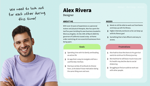
Worried that he will lose muscle mass and his health may decline due to social distancing
-
Struggling to find an outlet to work out with other people.

-
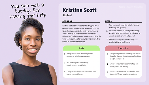
Limited amount of free online help for easing stress and anxiety
-
Has constantly had to scour for news about COVID and pandemic updates

-
Struggling to make nutritionally balanced meals
-
Trying not to get wrapped up in the politics of the pandemic and only read the news that routed in science
Scenarios of Use
In the process of prototyping, we sketched each scenario of use as a basis for our user flows. We then mapped out each persona and the specific pain points they experienced when going through their specific user flow.
Homepage
Support Our Mission
Form
Volunteer

Homepage
Am I Eligible?
Take a Survey
Create An Account
Intake Form
Welcome
Homepage
Why Trust ODIS?
Contact Us
Our Problem
Due to the COVID 19 pandemic people have been forced to isolate, leaving them lonely and with a lot of free time. Their loneliness is caused by a lack of community, physical activity, social distancing and excessive time spent indoors.
Our Hypothesis
02. Outlining the Experience
We believe that our app SOS (Surviving our Separation) will enhance pandemic users' home lives by providing accurate news and activities to do at home. This app will support those suffering by utilizing an empathic tone of the copy, an array of puzzles and workout options, and in particular, positive news articles and medically verified statistics informing them about the COVID19 pandemic.
Research and Discovery
Because this project is a redesign, we sought to validate our original ideas and seek new ones. Through new market research, several analyses, and a deep dive into our original designs, we wanted to make sure SOS still had its place in a post-quarantine world.
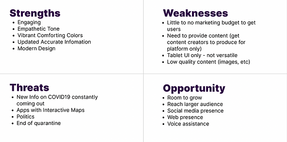
SWOT Analysis
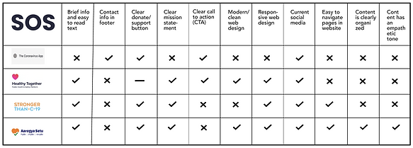
Competitive Analysis
Because this project is a redesign, we sought to validate our original ideas and seek new ones. Through new market research, several analyses, and a deep dive into our original designs, we wanted to make sure SOS still had its place in a post-quarantine world.
A/B Analysis
Before stepping into how our new app needed to look and function, we re-ran some of our initial user tests on the previous design, making notes and comments on aspects that needed to be improved on. Through this, we discovered several key aspects and features we wanted to focus on moving forward.
Inspiration
After looking at websites that are similar to SOS, we wanted to go further and get inspired by websites that had a clear and well defined design system. We looked specifically for good layering techniques, vibrant illustrations, their understanding of color theory and how these websites incorporated them. We did this to ensure our website is unique and stands apart from our competing covid apps.
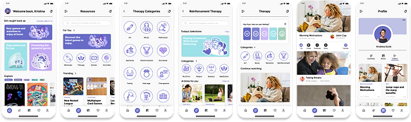
Style Guide
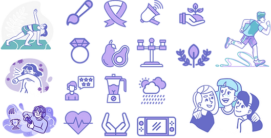
We developed our design system based on our inspiration and competitor analysis. We went with our specific color palette because it is versatile and each color combination works well together. We tried a couple of options for our typography such as Rubik and Fira Sans but ended up going with Inter because of its simplicity and straight edges.
We found that using this typeface also made it easier to read our copy. For our illustrations, we wanted to try something new and with heavily defined outlines but with a mostly monochromatic look. We chose illustrations that could be intricate but easy to comprehend the visual message. We designed our color palette based on our illustrations which are predominantly shades of purple, then added a blue as an accent.
Color Palette, Icons & Typography

Logo Design
The SOS (Surviving Our Separation) logo features a heart with a home on the inside. Because of the growing trend of people working and doing more activities at home, we felt the logo was still fitting in a post-quarantine world.

03. Creating the System
Icons & Illustrations
Sketching
Below you can view some of our initial ideas and brainstorm of what we wanted our redesign of the ODIS website to look like.

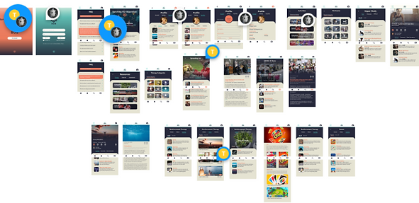
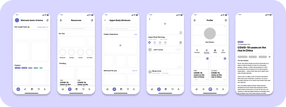
Mid Fidelity Wireframes
Transitioning our rough sketches into wireframes in Figma, we looked hard at things like components, atomic design, spacing, layout, and more. Running through several iterations of each screen, we landed upon the final layouts that we felt suited our user base best.
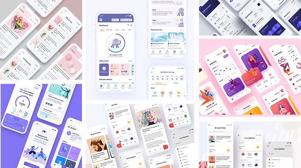
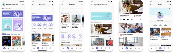
Final Wireframes
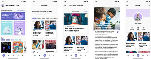
Our final SOS app design presents a colorful, inviting, and user-friendly app that sees major improvements over our original design and experience. Introducing colorful cards, more navigation elements within our information architecture, and vibrant icons, we polished our original design in a modern way.

User Flows
Support Our Mission
Form
Homepage
Volunteer

Intake Form
Take a Survey
Welcome
Am I Eligible?
Create An Account
Homepage
Homepage
Why Trust ODIS?
Contact Us
04. The Future of ODIS
Edits for the Future
We hope to develop an iPad and web version of this app particularly to increase the functionality of the multiplayer game features. Ensuring the relevancy of the news feature could lend to some meaningful collaborations with news outlets in the future as the pandemic winds down and other current events take the spotlight. In response to user feedback, the addition of a cooler shade into the project’s color palette would communicate the appropriate mood and avoid a sense of visual congestion.
